

Hotels Funnel at Tutu — From First Touch to Booking
Tutu is a major online travel service offering hotels, flights, train tickets, tours, and other travel products.
Our team’s main goal was to grow the funnel: bring more users into hotels, help them choose a hotel, and move toward booking.
Context
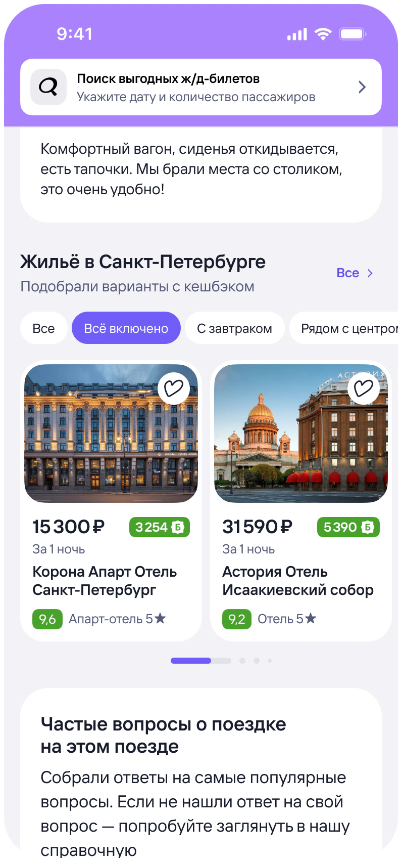
Hotels was a relatively new vertical within Tutu, and many users primarily came to the product for transportation. To grow it, we needed to both bring more users into hotels and reduce friction on the path to booking.
Instead of one large redesign, we worked on different stages of the funnel separately, tested new features through A/B experiments, and measured the impact of each change.
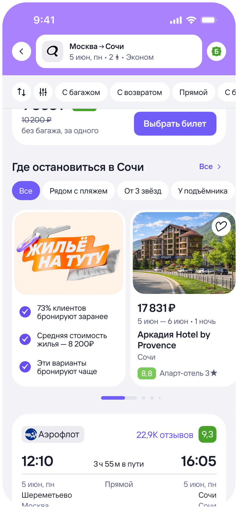
Expanded entry points into Hotels
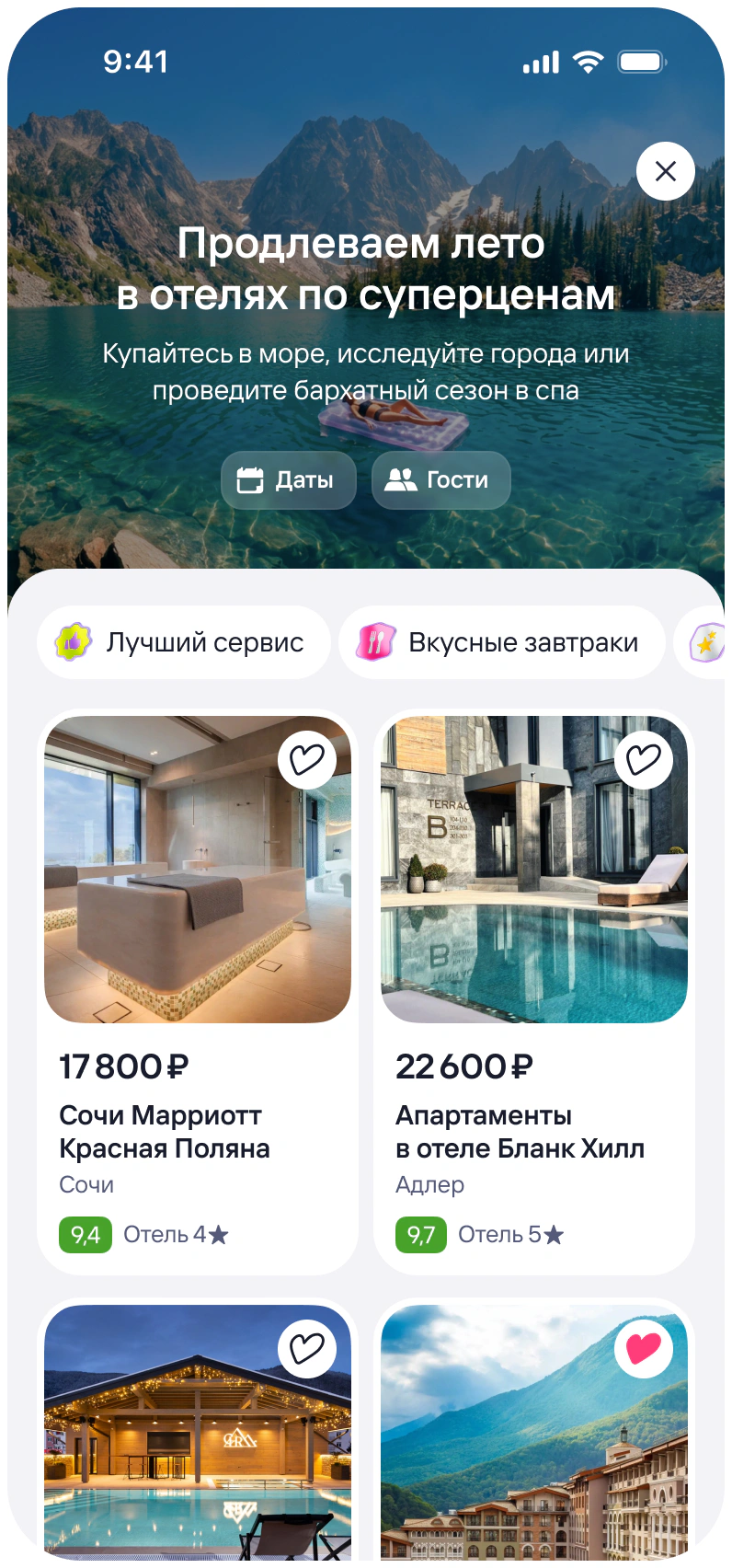
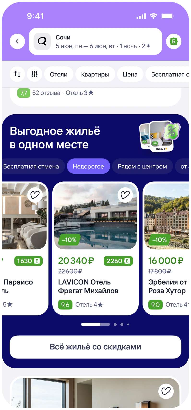
Universal hotel card
Problem
Hotel collections gradually appeared across different parts of Tutu and were built by several teams. This led to inconsistencies and made the collections harder to evolve.
- hotel cards varied visually and didn’t always fit the context of the screen;
- it was difficult to add relevant hotel details and support new use cases;
- every improvement required changes from several product teams, which didn’t always have the capacity.
What I did
I initiated the move to a universal hotel card and proposed that our team take ownership of further development of hotel collections.
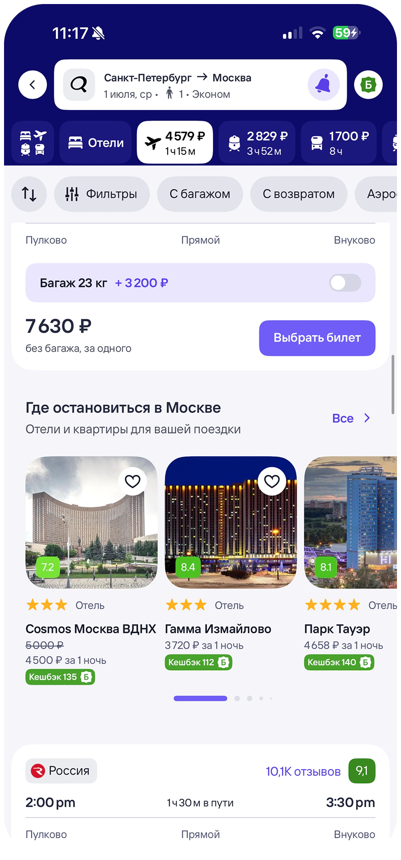
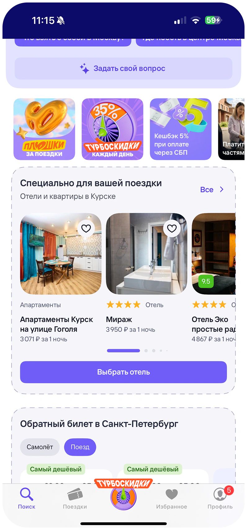
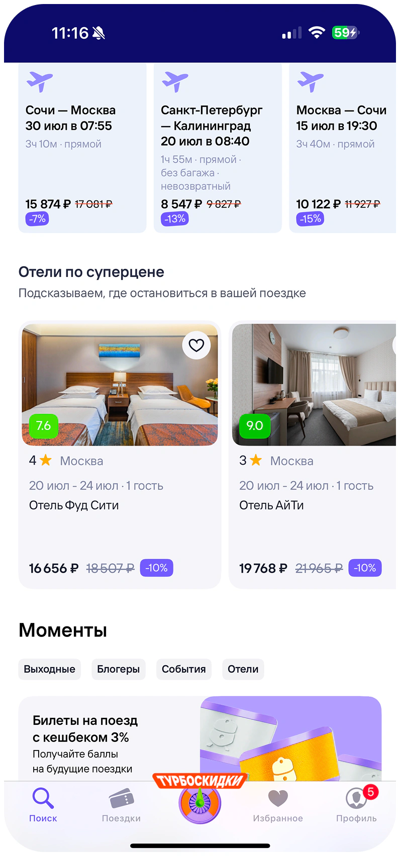
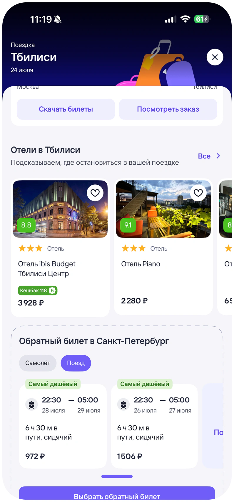
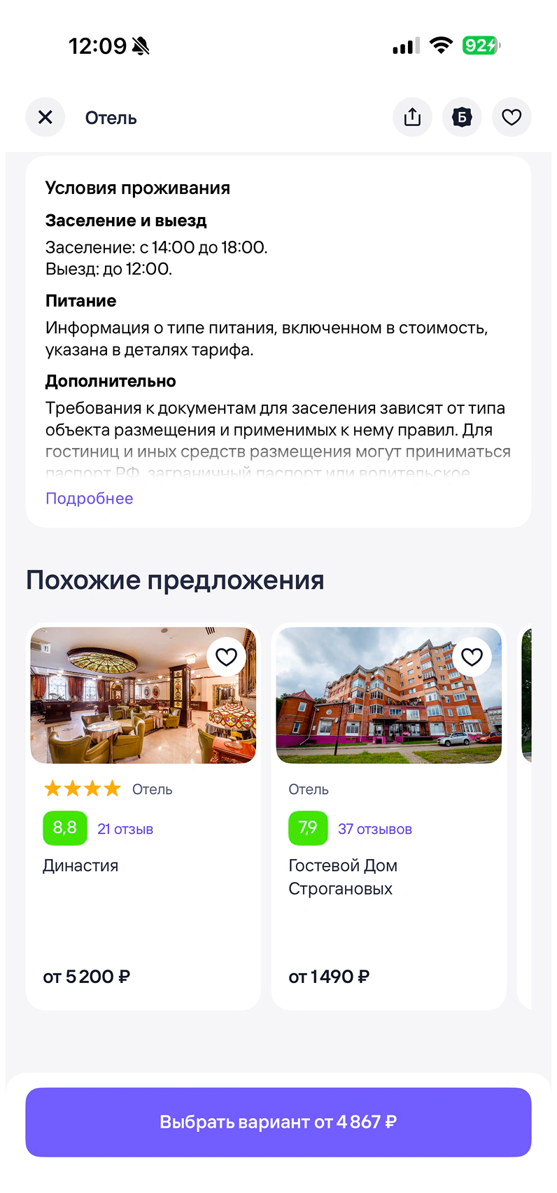
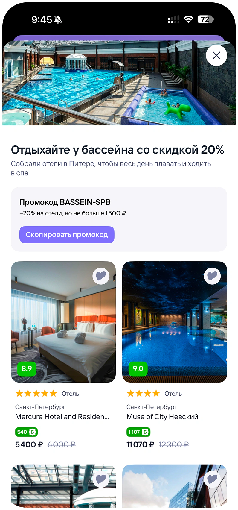
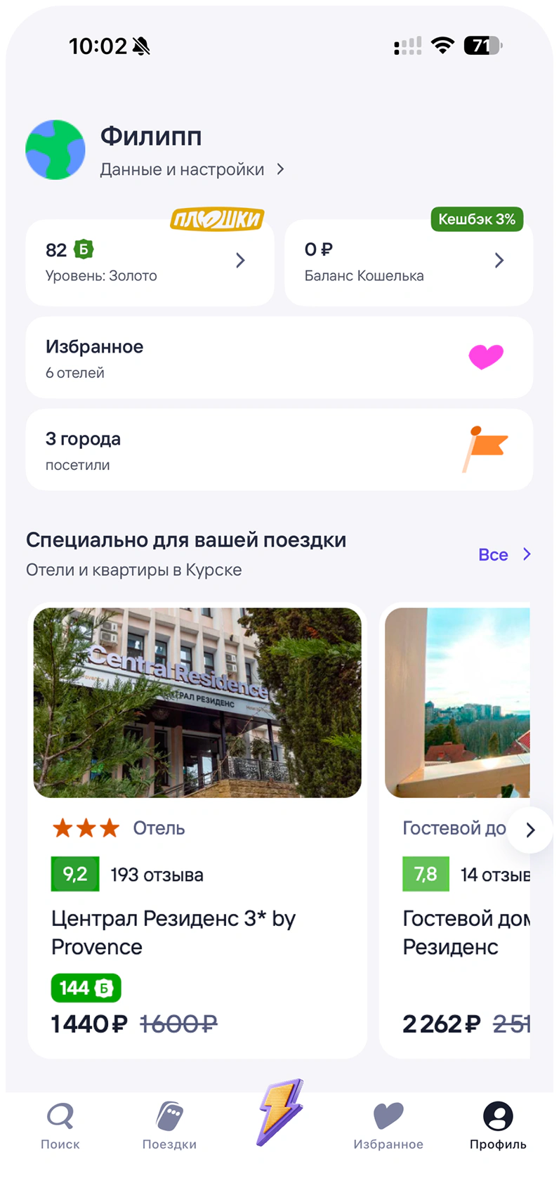
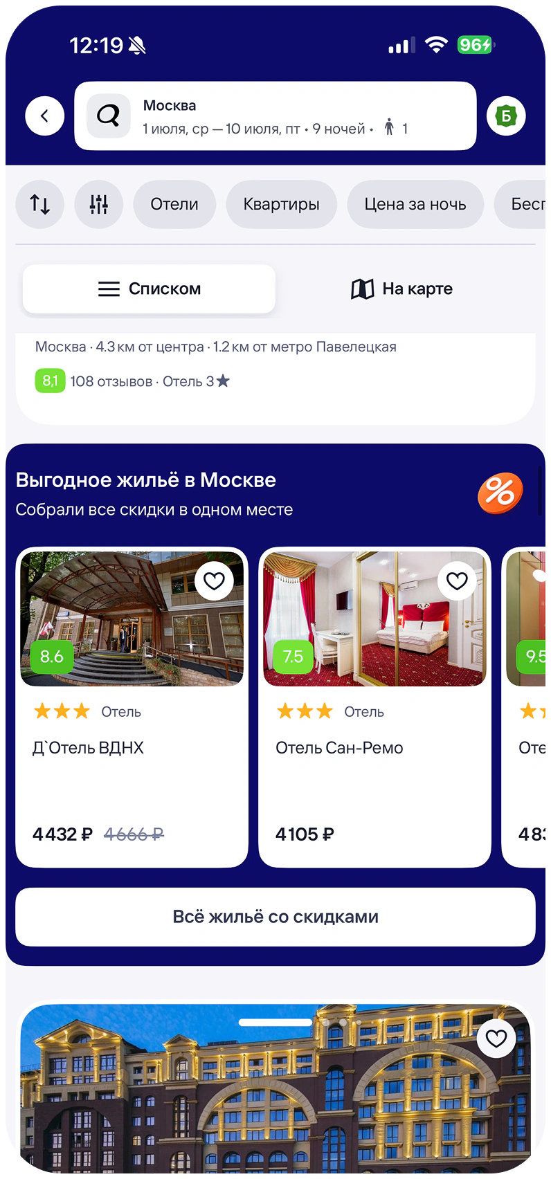
I designed the card to adapt to different contexts, support the hotel details each scenario needed, and accommodate new engagement mechanics.
To launch it, I aligned the changes with the teams whose flows used these collections and made sure their requirements were covered.
Results
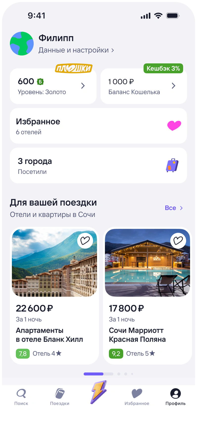
The card became a shared pattern across 8 scenarios in different parts of Tutu.
In the A/B test, the updated collections brought significantly more users into hotels. At the same time, we saw no significant drop in booking conversion that would prevent us from rolling the changes out.
Promo landing page system
Problem
Promo campaigns and themed hotel collections regularly needed separate landing pages, but the app had no reusable format for them.
What I did
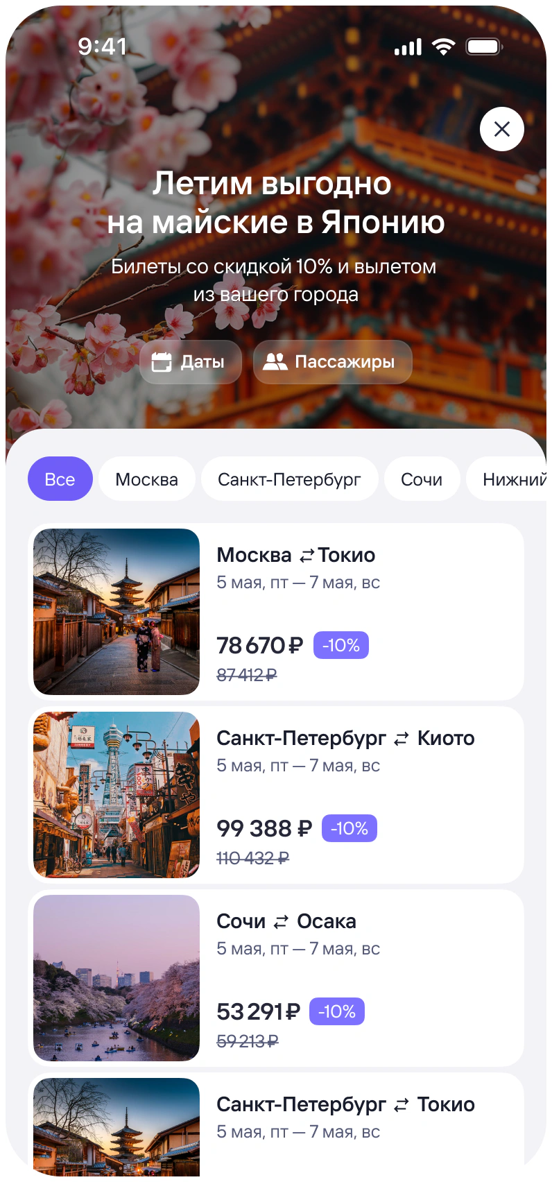
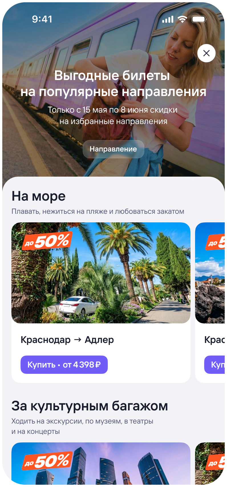
I designed a reusable page format, aligned a new visual approach with the design team, and adapted the universal hotel card for this format. Together with the engineering team, we brought the solution to production.
Result
After launch, the marketing team used these landing pages to bring more users into hotels. Instead of a one-off promo screen, we created a reusable pattern that was later adopted by other Tutu verticals.
Helped users narrow down their options
Problem
Search results could contain hundreds or even thousands of hotels. Filters helped, but users still needed to know which parameters to adjust to narrow down their options. Otherwise, they could keep scrolling without getting any closer to choosing a specific hotel.
Hypothesis
Instead of asking users to configure a large number of filters themselves, we could ask a few simple questions, narrow the results down to more relevant hotels, and make it easier to choose one.
What I did
I worked out how the feature would fit into the existing search flow, defined the quiz structure, and built the experience using our design system components. Together with an editor, I worked on the questions and answer options.
I also prepared a detailed creative brief for the marketing team and supported the production of the assets. Together with a researcher, I tested several visual directions and selected one for launch.
Result
73% of users who started the quiz completed it. Around 11% of those who completed it later made a booking. The high completion rate showed that users were ready to go through this type of flow, but the conversion from quiz completion to booking did not prove that the quiz itself increased the number of bookings.
Limitations
The A/B test did not confirm an increase in booking conversion. The observed 3.8% uplift was not statistically significant and appeared mostly at a later stage of the funnel, which the quiz did not directly affect. We therefore did not attribute this increase to the quiz.
The quiz was still adapted for all platforms and rolled out to all users for further observation.
Made the benefits of booking on Tutu more visible
Problem
By the time users reached a hotel page, they had already chosen a specific hotel but were still deciding where to book it. Hotels was still a relatively new service within Tutu, so the benefits of booking with us were not always clear.
Hypothesis
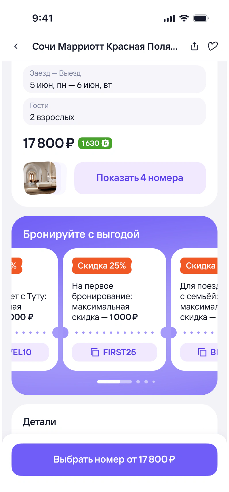
If we clearly showed the benefits of booking on Tutu — available discounts, loyalty points users could spend, and cashback they would earn — more users would continue to checkout and complete a booking because the value of booking through Tutu would be clearer at the point of decision.
What I did
Together with the team, we defined several segments where the benefits could be shown differently: first-time bookers, users traveling with children, users coming from other Tutu verticals, and users with existing loyalty points.
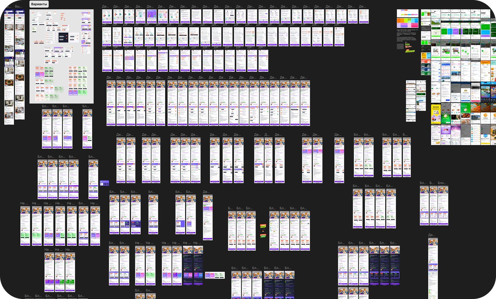
I designed the block structure, its placement on the page, and the visual hierarchy. Together with the product and design teams, we explored several variants, and a quick Pathway test helped us choose the one users noticed and interacted with most often.
What we measured
Our primary metric was conversion from the hotel page to checkout. We also tracked end-to-end booking conversion, and ARPPU to assess the impact on unit economics.
Result
Checkout-to-booking conversion remained almost unchanged. The effect appeared at the stage where the block was placed: the increase in end-to-end conversion came from more users moving from the hotel page to checkout.
At the same time, the conversion uplift came with weaker unit economics: ARPPU decreased by 6.4%, so we didn’t roll the feature out to all users right away.
What we did next
In the second iteration, we adjusted the mechanics: reduced the discount, tightened promo-code targeting, and slightly increased the promo budget. In the retest, booking conversion increased again, with no significant drop in ARPPU.
After that, we rolled the feature out to 100% of app users and adapted it for web. Promo budget spend was monitored separately.
What this added up to
These were separate experiments at different stages of the funnel, so their effects could not simply be added together. Together, they covered the journey from bringing users into hotels to choosing a property and completing a booking.
Not every hypothesis worked equally well: the quiz had a high completion rate but did not prove an increase in conversion, while the benefits block increased conversion but reduced ARPPU in the first iteration. That drop in ARPPU did not repeat in the retest.
The hotel card became a shared pattern across 8 scenarios, while the landing-page format was later adopted by other Tutu verticals.